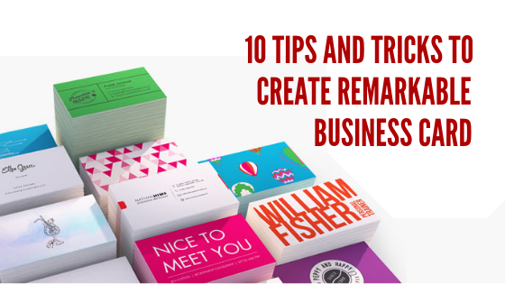
In today’s digital era, while it may seem that a business card has lost its essence, it’s quite the opposite. A business card holds great potential when it comes to creating the first impression for the clients. A carefully crafted business card can become a powerful face of the company and hence a powerful design is crucial in making an impact even after the meeting has been concluded. While using a logo maker to create a logo or a business card maker for a business card design, designers often have certain tips up their sleeves. Not only do these tips and tricks help make the whole design process easier but also ensure a fresh and effective design.
Here are some tips and tricks which can prove useful while creating a spectacular business card design:
- Address the 4 key W’s when you start with the design
As you start with a business card design, it is critical to answering the 4 W’s before creating the first draft. The business card must tell the Who, What, Where, Why. This ensures that the business card is not missing any essential information. Make sure to include the most necessary details. Some companies prefer to let go of the physical office address and only include phone numbers and email address.
- Clean and simple Text makes sure that the information is readable
Creating a business card can be overwhelming as the idea of adding all the styles might seem lucrative at the time. The key is to keep the font simple and readable. Over flourished fonts with small size might defeat the whole purpose if the information is not readable for the masses. Keeping the text clean and simple also gives the complete design a professional look.
- Use colours and hues cleverly to make the design pop
Some colours work well with others while some colours shine on their own. While creating a business card design, it is important to consider the kind of colours and hues to be used. While deciding the colour for visual elements and background for the card, it is imperative to consider the colour of the text as well.
- Add a styling effect for an extra design edge
All businesses, new or old use a business card. Considering this, some aspect of your business card design must make it stand out of the rest. Adding some unique style such as an embossed text or an embossed logo ensures that it is more engaging than the others.
- Make grids your best friend while designing the business card
This might seem obvious but laying down a grid when you start designing a business card can make all the difference. Even though you might be using a professional graphic designing tool or an online business card maker, grids can prove very beneficial. Grids not only help achieve symmetry in the design but also provide a framework for any edits down the line.
- Add the visual component to make the design stand out
Images speak louder than words when it comes to capturing attention. Most of the business card designs follow the same basic layout and therefore appear the same on a first cursory look. An impressive visual element in the card design can make a great statement and help stand out.
- Incorporate the logo and company colours in the business card design
A business card is the identity of a business and hence the design must be in sync with all the elements of the business. It is pivotal to incorporate not just the logo but also the logo or company colours in the business card. If you are not having your logo, then you can create your own logo online using an online logo maker tool.
- Give a long hard thought to the paper thickness
A business card has maintained its essence even in today’s digital era due to its tangible aspect. As the clients can hold and feel the business card, they feel connected to the business. Therefore, choosing the right cardstock is very important. A strong and thick cardstock makes a huge impact as it looks more professional and poised.
- Don’t forget about the bleeds and borders at the design stage
Bleed sizes vary from printer to printer and no matter how precise are your measurements on screen, if there is a border in the design, it may not be printed properly. Make sure to keep the text and all essential elements well within the print area to avoid any printing hassles.
- Proofread the complete design before printing
When all this effort is going on in the designing of a business card it is crucial to check it at every stage, especially before sending it for print. A small spelling error or incorrect phone number cam render the entire exercise futile and not to forget result in extra expenses. Therefore always proofread the design and information once it has been finalised.
Many business owners these days take an active part in the whole designing process. With online graphic design tools such as Designhill, this process has become even easier. The business owners can either browse and customize the business card on their own using some simple steps or create a contest where professional graphic designers can compete. These have created avenues for the business owners to share their input, inspiration and vision for the design. A business card design is as critical in the branding strategy for the company as a logo design and hence must exude the company’s personality.


Leave a Reply