Building a website is easy enough, but it can be challenging to make it appears consistently on multiple web browsers and platforms. Many designers are spending much of the development time on one or two platforms. This means that they can’t always guarantee the highest degree of standards. Sure, not many people are using Windows 98 anymore; but we shouldn’t only focus on Internet users with Windows 8 and Windows 10. There are actually machines out there that still use legacy operating systems and web browsers due to specific reasons. Highly improved website may no longer work well older browsers.
This also applies for some Linux users who still very old versions of Red Hat Linux and Debian. Platform issues aside, Chrome, Firefox and despite’s Microsoft inclusion of Internet Explorer with all Windows OS versions; they don’t represent our only web browser option. There are many more obscure free web browsers out there. It is clear that our website should be able to match all the compatibility requirements. Fortunately, there are many design options that we can choose to make sure that our website will be compatible with many platforms in the market.
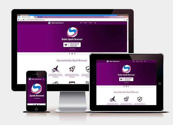
In many cases, our web design should work well if it is focused on the most common resolution used by users, such as 1366 x 768. If there are multiple resolutions that we need to focus on; we could use two or three resolutions simultaneously. This should allow us to adjust resolutions dynamically on each monitor, making it easy for us to see how the website could perform on a screen resolution. In any case, our website should look appealing on the widest range of users and it should be designed in a way that it needs to look well at many resolutions; even if it is very low.
It is also possible for us to use tables to control the width of our web design. They should be wonderful for controlling how images and texts should go together. We could set tables to use fixed or dynamic width; both in values or percentage. In order to allow for more fluid layouts, it is important to use percentage. If we want our website to look consistent in any screen resolution, we should make sure that texts are able to behave properly around objects, such as images and side navigations. In this case, we need to use fixed pixel width and we may need to make some compromises. As an example, if the website looks best at 1366 x 768, tablet width should be set around 1250 to 1300 pixels.
Another thing that we should consider is that we need to compromise the use of fonts. There could be slight differences between how web browsers render fonts. As an example, fonts tend to be smaller on Mac OS X than on Windows OS. We should also know that older users may enlarge fonts on the web browsers to make it easier for them to see. Without simulating how fonts are displayed, we could start to lose control how these fonts are shown on the screen.