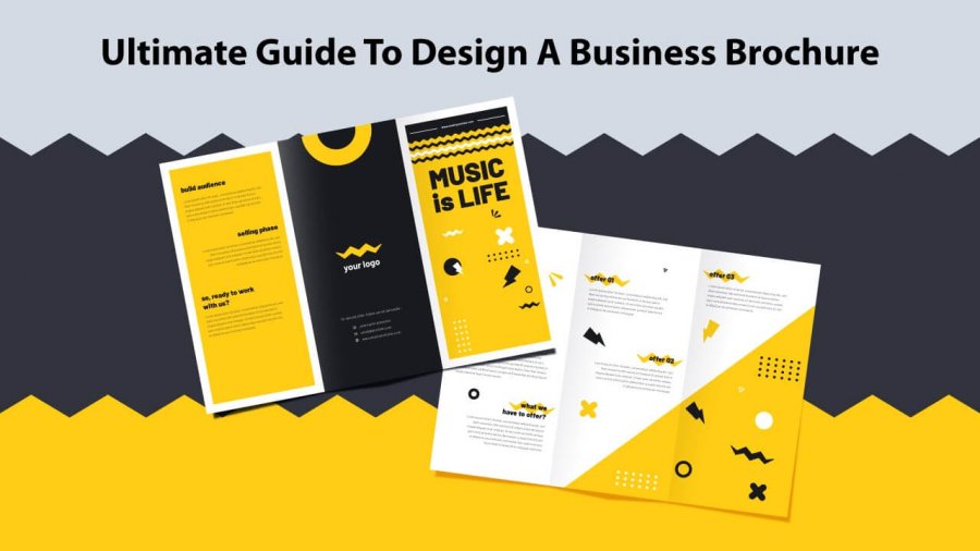
A sales brochure is an essential marketing element that draws the audience’s attention. But how can you make it effective?
If you’re looking to create a brochure to announce the launch or a new product/service, you probably want it to get a good response. Creating and sending brochures include marketing expenses. Besides cost, you should pay attention to every piece of information written on it too.
But how can you make sure your brochure designs will be the winner? Here we are going to discussed the top ten proven ways to create a compelling sales brochure. So, keep scrolling —
Have a clear concept of your purpose before starting
To make your brochure design effective, it’s significant that you know its purpose first. Knowing the purpose will lead you in the right direction. Find out what the brochure is for — is it for advertising, product launch, an event, or a concert?
The more you know about its purpose, the better you can create its design.
Collect as much information as you can. And then go for the design accordingly. Also, keep in mind that a brochure works as a communication tool with your audience. Every piece of info you put into it establishes direct communication with your target audience.
Know the customers
Since a brochure serves as a communication tool, it’s significant that you know the customers and target market. This allows you to capture their attention with the right intent.
For example, if you’re targeting travelers, choose a design that has something to do with traveling. The more you draw their attention to their needs, the more influential the brochure will be.
If you have no information about it, don’t worry. Take your time and have words with the salespersons or the audience. Leverage their response to finalize the design that you want to render and what they exactly need.
Limit font usage
Whether you’re creating professional book cover designs or brochures, it’s natural that you may go overboard with fonts. While it may be interesting to see a brochure design in a few fonts, sometimes, it works as a discouraging factor for others. It may put off the interest of potential customers.
So, limit yourself with font usage. Choose fonts used in your company’s branding. You can use a single font for the entire brochure or add two more to highlight critical elements.
Show off your creativity & unique concept.
Creativity is what set you apart from others. When competition is on peak and creativity is staggering, having unique concepts is of utmost importance.
Aim for a unique and original design. Make sure the uniqueness of your brochure designs is easily recognizable. Create a design that looks tempting and compels people to pick it up from a rack filled with other leaflets.
Use creativity to strengthen brand identity.
Keep your brochure clutter-free
Even if you’re using a brochure maker or designing it on your own, steer clear from listing down all the details in a single brochure.
Avoid adding all the company details and providing detailed information related to the products/services. Too much detail will end up confusing the customers and deviate them from the purpose of the brochure.
Instead, you can focus on just the key information to catch the attention. Pin down the relevant info so that people can quickly grasp it.
Use relevant images for easy understanding.
Sometime, an image is worth a thousand words. Use relevant images in your brochure to grab attention. Customers want to see the exact images of the products you’re selling. Once they see the picture, they create a relationship with that particular product.
So, if you want to charm them, add clear and professional images.
Stop direct selling, enhance their knowledge.
Customers find brands off-putting that sell them directly. Before making any purchases, they want to hear a story; they want to be impressed and create interest.
In fact, your prospects really don’t want to buy until and unless they know your brand well. Your brochure design has to include benefits that they’ll like by purchasing from you.
Before writing content for your brochure, list down the benefits that would entice your prospective buyers. Use this list to create a focused copy that’ll be helpful for the people.
Consider the quality of your paper stock
Just like design elements, paper quality matters a lot. It can make the overall look of the brochure. If you’re designing for a client, ask about the paper size, whether it’ll be the standard A4 or something else.
Avoid big and confusing words
The more jargon or confusing words you use, the less the response you’ll receive. You don’t want to impress your audience with fancy, decorated words, right? The more you use such terms, the harder it becomes to get your message across.
Use simple English for brochure designs.
Add a call-to-action
No matter how well your design your brochure, there is no use of it if it doesn’t have a call-to-action. Just because your brochure looks beautiful doesn’t mean your audience will come running to you. Even if your brochure design is gorgeous, motivate your audience to contact you.
Put contact details such as email address, phone numbers, and locations clearly, so that they could approach you without any problems.
Hire a professional designer to get your design work done, or use a brochure maker if you know how to design.
Other than that, you can visit sites like Designhill for brochure design inspiration. The designs listed over there will help you create a concept, understand color combinations, and then work accordingly.
Consider all the pointers we discussed earlier because it’s going to help you a lot. Get a clear idea of the exact design goals you want to achieve and create something out-of-the-box.
If you have any other tips than what we listed earlier, feel free to share them with us in the comment box below!
Happy brochure designing!
















Leave a Reply