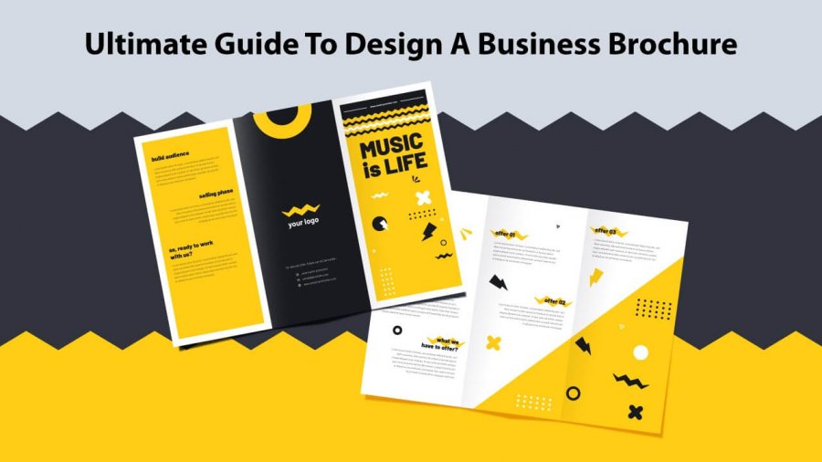
Brochures are one of the major versatile advertising platforms. Most businesses consider a brochure as a part of the marketing process. Brochure essentials that can save you from failure are here. The benefit of the brochure guide comprising importance, design factors and how you can get it all done by yourself.
Make A Brochure Work For You:
More and more businesses are adapting brochures to promote their products with brochure templates. Why? As, to date, people take notice of brochures before any product purchase. This is a means of cost-effective marketing that drives you some kind of result at some point in time. The main concern here is how can you make the most of it early and before time.
Laying brochures on palms tend to derive certain reliability on the brand and makes it look committed to quality. Brochures don’t just mean to get it printed & widespread among people, but an effective presentation is what credits through. Let each rightful information of your brand be spoken out with the help of marketing brochures.
Brochure Designing Aspects To Count On:
Have you ever found yourself in a situation where you doubt whether my strategy will come under effect or not? It’s because you aren’t aware of what aspects readily drive better results. Here are considerable brochure design tips to put an edge on. Some designing factors that decide design outlook in consideration of reader’s mind are as below:
-
Aim Your Reading Audience
Here, at first, we need to target the market where we are planning to distribute our pamphlet. The targeting process can be a troublesome task but a conforming audience outline can save you time and money. As it said, Marketing material spread to all can bring lesser than well-targeted.
Basically, a possible target audience can be someone for whom you are making products for. It is observed that quite a lot of marketers fail ineffective marketing as they stick around on traditions. Narrow down your audience based on geography, highly visible areas like across trade shows, fairs and exhibitions.
-
Add An Emotional Touch
This counts in emotional branding brought on impact with the customers and branding by hand. Establishing an esteemed brand comes with a subtle loyalty that can be entrained by creating an emotional connection with your audience. Develop a particular emotional branding strategy that is winning in itself.
Most popular brands like Nike, Apple focuses on different tagline each time demonstrating product features and a personal touch perceived in the form of quotes that caresses deep and stays for lifelong. Always invest in customer service and support as it impacts well on emotional memory.
-
Keep It Brief And Easy
With an effective design, strategy comes to some presentable brochure traits that you don’t need to miss out on. Many businesses prefer brochures for marketing, but what a couple of them fail on is how to put together a certain amount of text. You never want your brochure to end up in the trash.
Often it is observed, that leaflets with too much information are likely to be ignored as people are always in a hurry and if you want it to get noticed, you should keep it brief, the information stated in bullets (that is easy to read) and include illustrative images. Also, enough space between paragraphs is an elementary soul to an airy brochure.
-
Make CTA As Focal Point
CTA stands for the call to action statement. It is intended to provide the reader with a phrase with an actionable task. Provide them with a reason to entrust your brand once for satisfactory results. Some call to action phrases can be: Check this out, Buy and Save, Save up to, Request yours today, etc matching your advertising preferences.
You get assured end results with the effective usage of CTA. But you probably would miss out on your prospect’s action if you aren’t even trying to push them. Letting them focus on your CTA is one out of many responsibilities you need to fulfil. It is a compulsively driven task both for you and your prospects through which even you can measure your credibility.
-
Limit On Excess Typefaces
Usually, a typeface is misinterpreted with fonts. Although fonts are a part of a typical typeface. It comprises symbols, numbers, font all in a whole of a similar type. Now what goes wrong in designing an advertisement is: We usually tend to differentiate the heading, subheading, content, etc and we end up choosing separate typefaces for all.
Multiple typefaces result in a cluttered and clumsy design outlook. You wouldn’t ever want to set important information in a funky typeface as it would be hard for eyes and subject either. Mostly two typefaces would suffice for every possible layout. Go bold and cursive for a distinctive approach.
Get Your Brochure Designed In No Time:
Now you have known the basic traits of brochures that help to fetch the reader’s attention. It is time to get your business brochure produced. Drop your plan of getting it designed by any graphic designer. This is a task any novice would carry out in assistance with an online brochure maker.
Any brochure creator tool would come up with several brochure templates that provide an ease to be able to customize it on your own. It saves your money, time and effort at the same time. You get to fetch a suitable template, drag and drop some of the design elements and download the design. Share it across digital platforms, via email or even get it printed in insignificant numbers.
Conclusion:
Designing a brochure for your business is no more a hectic task, you have an option of ready-made templates to design one. But while customizing keep the important factors that attract the user’s attention in mind. Your brochure must have catchy headlines, CTA, attractive images and fonts in place. What are you waiting for, take a step forward and design your brochure now.

