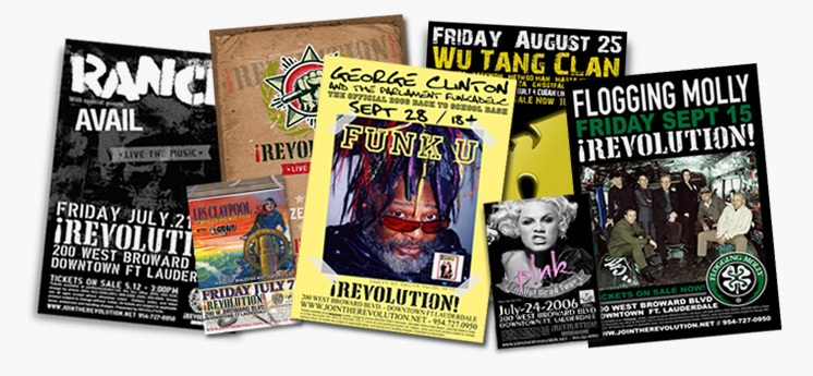
When you’re promoting a concert, one of the most important things you need to do is ensure your flyer makes people actually want to go. The reason flyers are still used is because people still like a physical reminder of what they will be attending. Social media is a fantastic way to promote a concert, but nothing quite beats handing out sharp, high quality flyers that make people want to get involved and join in. Designing a great concert flyer can be difficult and it’s not always an easy feat if you don’t have much design experience.
Here are some tips for designing a great concert flyer:
Information Matters
Before you do anything else, figure out what information needs to go on the flyer. What do you want people to know from the flyer. Remember to keep information at a minimum – visuals are everything. Focus on who is playing, where and when they are playing and how much it costs to get in. If the attendee gets a discount with the flyer, make that information clear. Bear in mind that people are only likely to glance at the flyer, so the information needs to be really clear and concise. If you have a lot of information you feel needs to go on the flyer, work through it over and over again until it is in really simple digestible chunks.

Don’t Over Format The Text
Often people will put several bullet points on a flyer which takes away from the message. Bullet points are meant to divide and layout information, but shouldn’t be used excessively as they can dilute the information.
Images
If you have copyright free images you can use on the flyer, go nuts with them and use them to make the flyer stand out. Images should be a key priority so if you don’t have any copyright free images, don’t settle for not using any. Use the internet to get your hands on the wide amount of free images. Even if the images are not of the bands playing, they could still reflect that a band is playing. Flickr Creative Commons is a really good source of free images, just make sure you credit the images properly.
Reflect The Image Colours In The Flyer Design
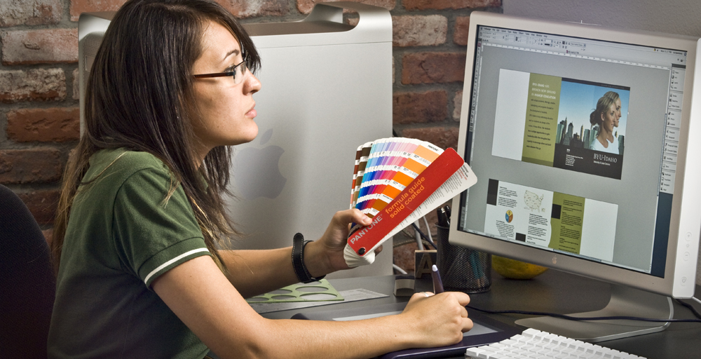
To make your flyer flow, try to pick out colours from your chosen images and use them in the rest of the flyer. So if there is a person in the picture wearing yellow, or there is a strong blue or purple in the background of the image, use that colour in the rest of the flyer. There are lots of editing suites and online apps that will enable you to pick that colour out and use it in the rest of the flyer.
Give Your Flyer A Killer Headline
Make sure that your flyer has an amazing headline that people remember. It could be something relating to the event, or even just a cool catchphrase that relates to your target audience. The headline should be eye catching but doesn’t need to be at the top of the flyer, just somewhere clearly visible, using clear font and contrasting with its background.
Give Your Key Information Priority
When you’re adding your text in after deciding on the colours being used, you need to ensure your key information has priority. Move text around and play with different sizes of text to see what works best. At a glance you should know who is playing, when they are playing and where – that is your key information. The headline draws the reader in, then they need to see the rest of the information clearly ahead of anything else you want then to know.
Make Sure All The Marketing Matches
If possible you should ensure your flyers match your posters and are the same layouts and images used in online advertising as well. The more coherent your marketing campaign, the more memorable it will be. If people keep seeing the same posters and flyers popping up on and offline, they will become curious and want to know more. You could even use the same design on your tickets, just be sure to use hologram labels to ensure they are secured.












Find Us on Social Media
A MarTech - Marketing and Technology Blog