The problem with humans is that we get bored very easily. On one hand, this is not a very desirable trait, but on the other, this urges us to create something new and different all the time. Now, that we have had more than our fair share of looking at websites, we have grown quite tired of the same old design. In the initial years, when we did not know how to go about in a website, we appreciated clear-cut instructions. Now, we want innovation.
Since, storytelling is an art that has survived the changing trends and emerging technologies, it can salvage your website from the monotony of the boxy designs. However, just as not everyone can be a good storyteller, not every design can tell a story effectively. Here are some guidelines that can help your design tell a story with ease.

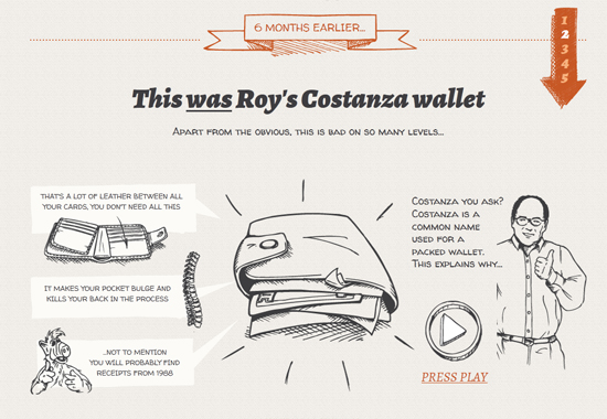
Bellroy – Slim Your Wallet website tells the story of Roy that represents people around the globe. This is a brilliant example of story telling via a visual platform.
Plan before Action
A good storyteller arranges the story in his mind before narrating it to an audience. This makes his stories believable. Similarly, before you begin designing, you need to get your story straight. You need to think about your audience, the reaction you want to evoke and the moral of the story. The images and symbols that you use in your design should not be random over the top spectacle. Use images that are relevant to the message you want to deliver and make sure all the images and symbols cohere together to keep the story flowing.

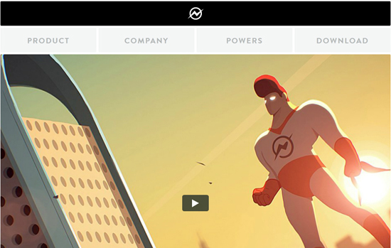
Captain Dash represents a superhero who helps customer’s marketing campaigns from getting complicated.
Non-Linear Design
What is non-linear? The word itself means something that does not flow in a straight line, but how does it relate to a web design? It just means that the design need not flow in particular order to make sense; the individual components should be coherent on their own too. You never know which page the user will land on so it is important to give some kind of relevance so the person does not seem lost. Often a backlink to the start of the story helps, but it is always better to keep the content of the page in context with the brand so they never feel that they are in the wrong place. Be innovative but not so starkly abstract that the audience fails to make the connection between the story and the message.

MotoCMS Templates is a treasure trove of fresh templates that tells story via a vivid visual platform.
Audience Appeal
Unfortunately, in a web design, you cannot gauge audience experience so you are never sure whether they are intrigued or bored. The first thing you need to know about internet audience is that they get bored easy. Your site needs to be either point-blank, that is, give them the information immediately or send them on their way or keep them on your site, entertained. Interactive storytelling works better than the passive kind, make them click on stuff to make something happen, they will be more intrigued!
Optimize the Visuals
When you have decided to use visuals to tell your story, it is important to know about some of the iconic images that speak volumes. We automatically relate some images to certain specific things. This connection is either learned over the years or instinctive. For example, the man and woman icons displayed on restroom doors have become a universal icon. Wherever you see those icons together, you know there is a restroom nearby and you do not even need to know the language! Similar icons like pointing-finger representing direction, a light bulb representing idea, etc. have become universals icon. When you use these icons in your storytelling, you instantly become more familiar to the audience and hence more acceptable.


Leave a Reply